NEW: Macro Bicycle
Intermediate Level
In this artwork we create a macro drawing of a section of a bicycle. In photography, macro means “up close.” Rather than drawing the whole bicycle, we’ll concentrate on just one section, choosing a part that is interesting because of its shapes or textures.
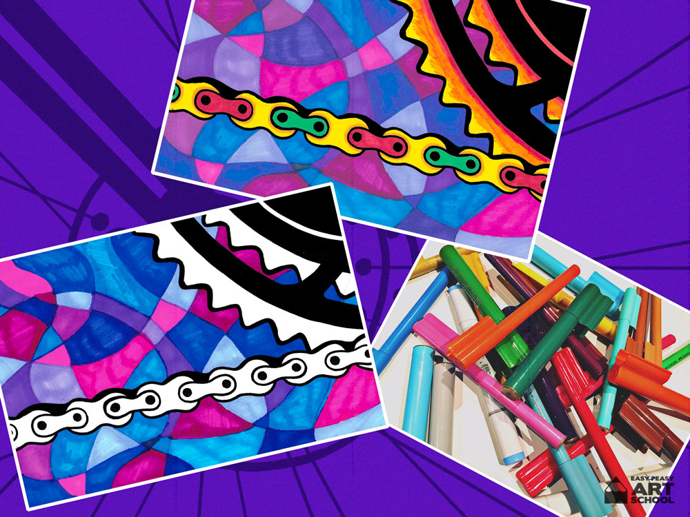
Once we have created our macro drawing, we’ll add colour using paints or markers.
Materials
- A bicycle
- Tablet or digital camera
- Sheet of white paper
- Drawing Pencil
- Black marker
- Eraser
- Optional: Ruler
- Your choice of paints / coloured markers or pencils to add colour
- Newspaper or table cover to protect workspace
Easy Peasy Tips:
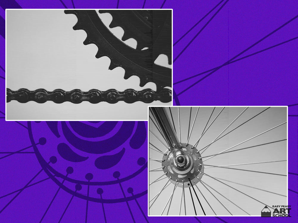
- To begin this lesson you will need to take ‘macro’ photos of different parts of a bicycle.
- Use your tablet or a digital camera so that you can edit your photos.
- When taking photos, make sure that they are in focus which means they are nice and clear.
- Try to take photos of different parts of your bike that have interesting shapes or textures.
- But at the same time, try not to choose parts that are overly complicated or that have too much detail. Set yourself up for success!
- Once you have taken your photos, go through your set of pictures and choose the best ones. You could even crop or rotate until you create a composition you like.
For The Teacher:
- If you choose to take photos of bicycles with your class as part of this lesson, some students may find it difficult identifying suitable bike sections to use. An important role of the teacher in this lesson is that of helping the students to identify what is suitable and not too difficult for them to draw.
- Another option is to use the photos provided in the lesson. These photos have easily identifiable shapes and lines.
- If using markers with your class to add colour, try using a smaller sheet of white paper so that the students are not colouring for too long.
- If using water colours, make sure you trace your design using permanent marker or the black will bleed.
Steps
Place your paper landscape style
In our artwork, we will use paint to add colour to our design. Don’t forget that you also have the option to add colour anyway you like. For example using felt markers.
The first part of this lesson is choosing to take photos yourself or deciding to use ours as inspiration. Which one will you choose?
Do you notice how we have edited our photos to be black and white? By doing this, it helps us to concentrate on lines, shapes and textures rather than distracting colours.
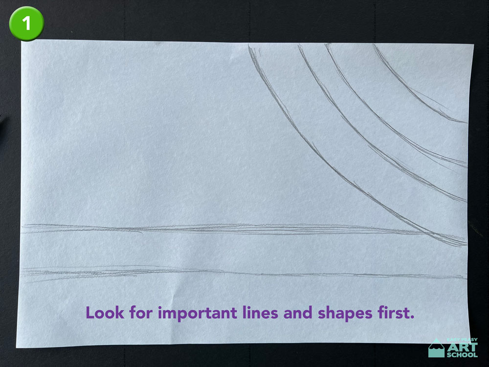
- Drawing: To begin your drawing, look for the most important lines and shapes first. Don’t worry about little details. When we draw something from real life, it is all about looking for shapes and lines. Lightly sketch what you think is most important. Your sketching does not need to be perfect. It can look messy or scratchy, that’s perfectly okay!
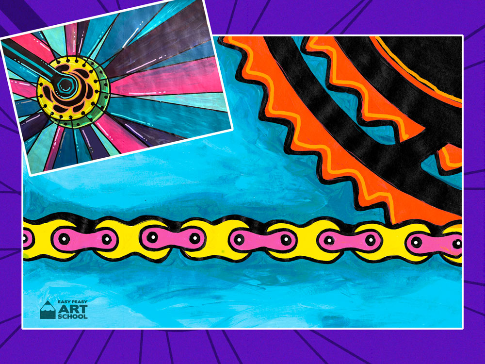
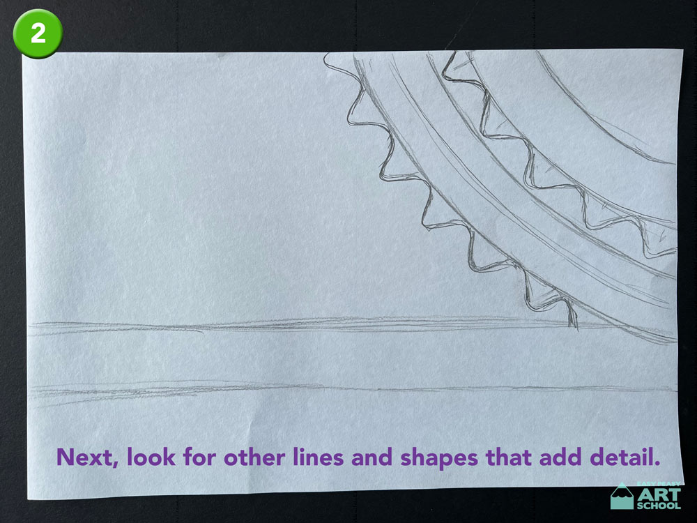
- Next look for other lines that add detail to the object. In our design we added the outline of the big cog. Look really carefully as you may see things that you didn’t notice at first.
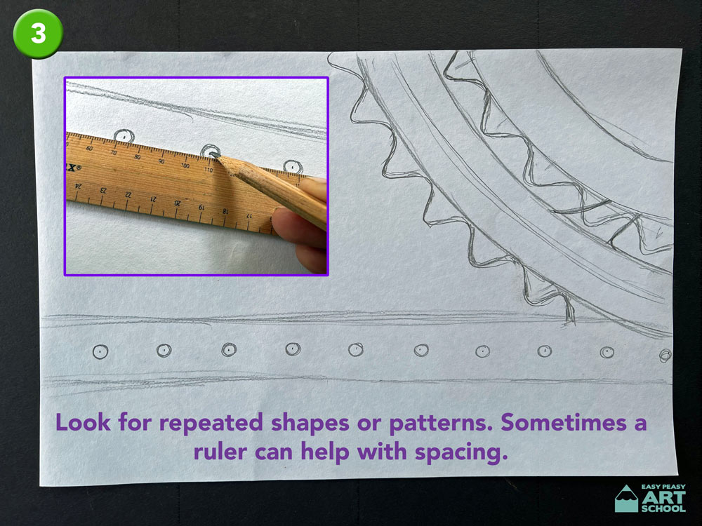
- Do you notice any repeated patterns or shapes in your photo? Sometimes it is helpful to use a ruler to help with spacing and the planning of your design.
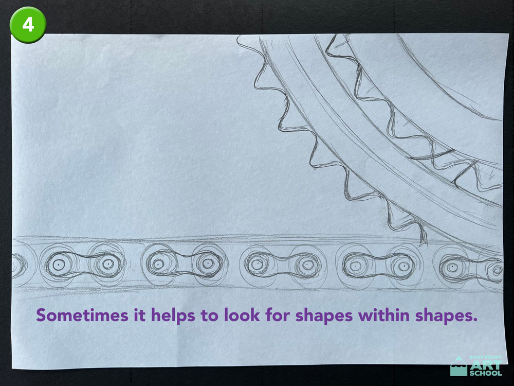
- Another tip is to look for shapes within shapes. For example, we noticed that our bike chain was made up of loads of curves. These curves are basically made of circles. Lightly sketch in these shapes within shapes. Think of them as a skeleton or frame underneath your drawing.
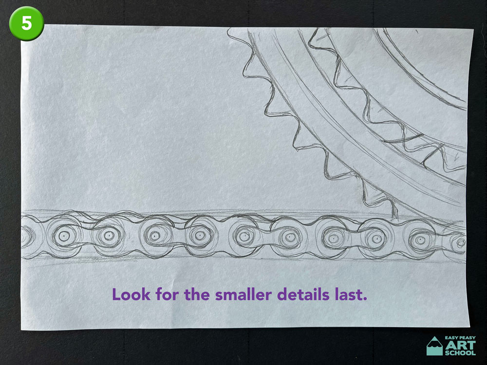
- Add more lines to join these shapes together and then complete your pencil design by adding smaller details last.
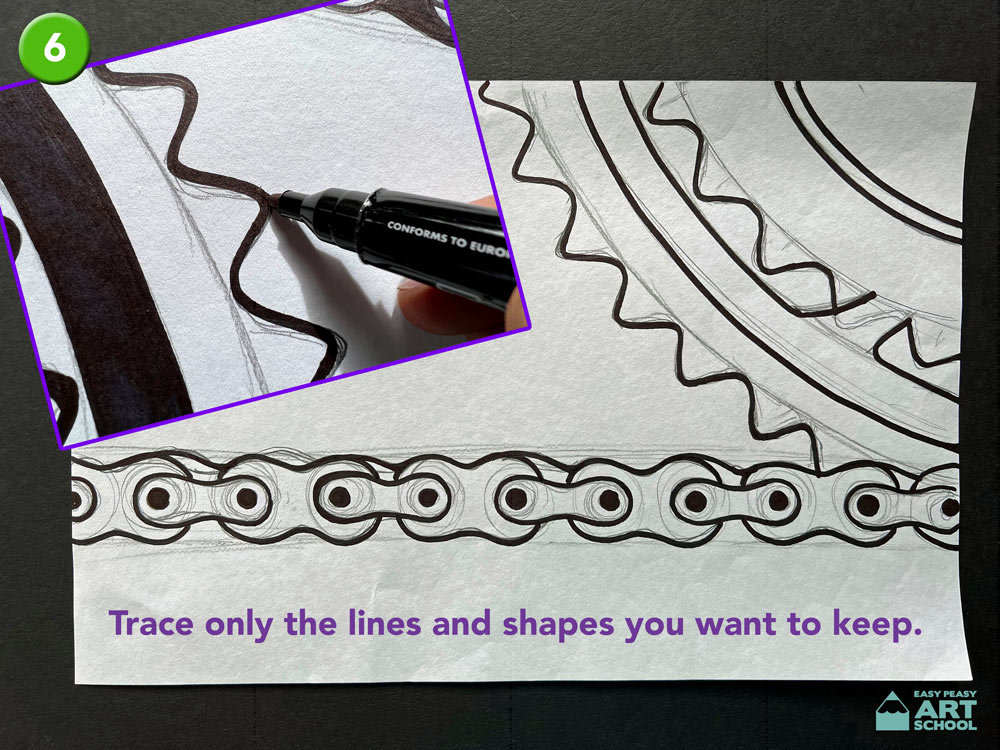
- Trace your design using permanent marker. Remember to only trace the parts we want to see not all of the mistakes or framework underneath. Also don’t forget when using permanent marker to always put something under your work to protect the table.
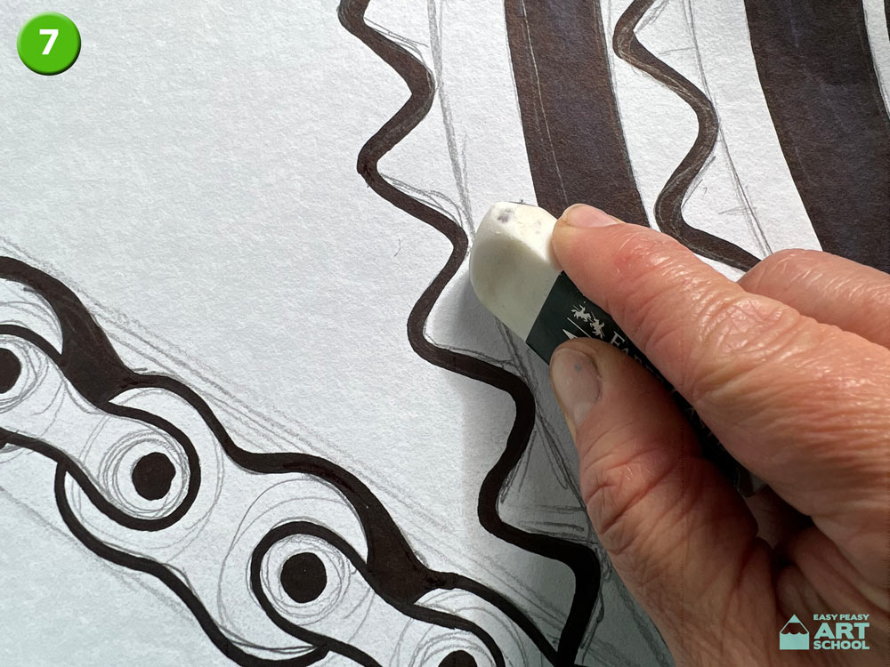
- Carefully rub out your pencil lines using an eraser or we will see them through the colour.
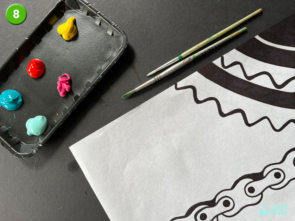
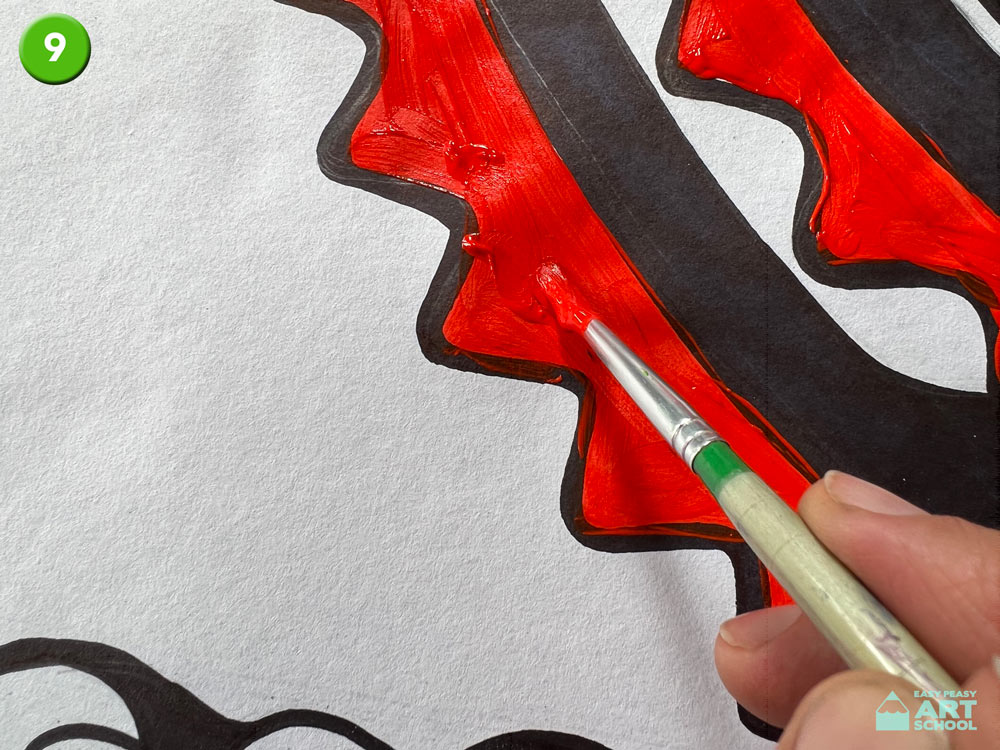
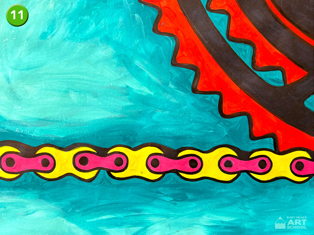
- Painting / Adding Colour: Choose colours to enhance your design. Think about colours that you could use to really make your design pop. Think about using contrasting or complimentary colours to show the difference between the bike parts and the background.
- Be careful if painting to stay inside the lines. Try using a smaller brush for small shapes or spaces.
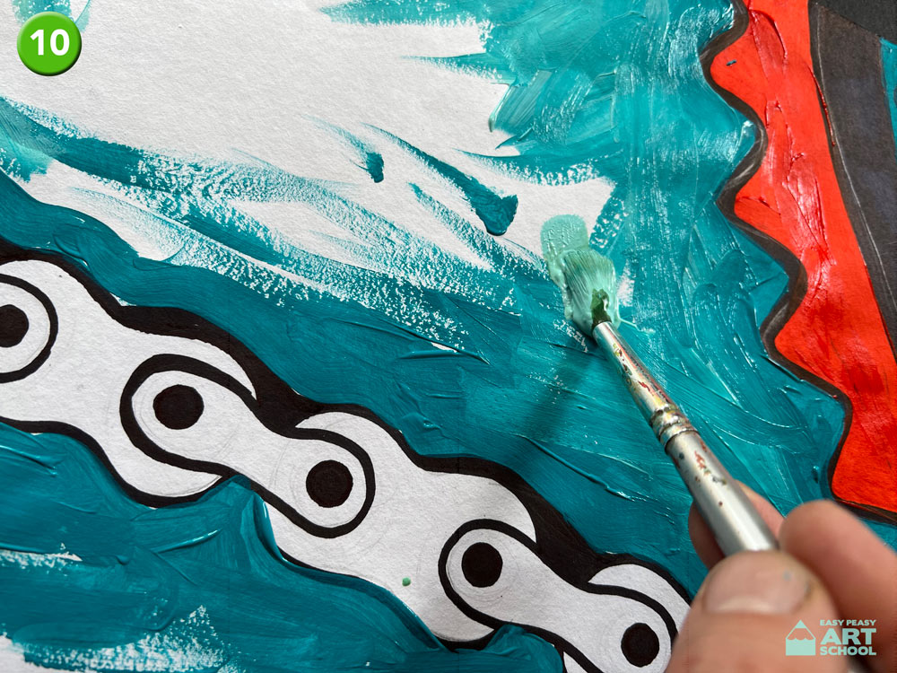
- When painting the background, try blending lighter and darker shades to create interest in the large empty space.
- Keep adding colour until all the white spaces have been filled.
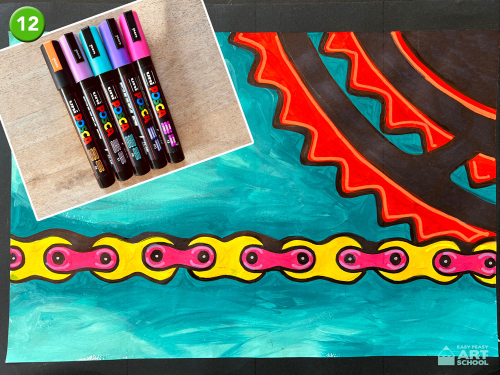
- Optional: If you have paint pens such as Posca’s, think about adding extra detail and colour to enhance your design.
What do you like about your artwork? What would you do differently next time?
Other ideas:
- If you liked this bicycle inspired artwork, why not try our continuous line bike lesson?