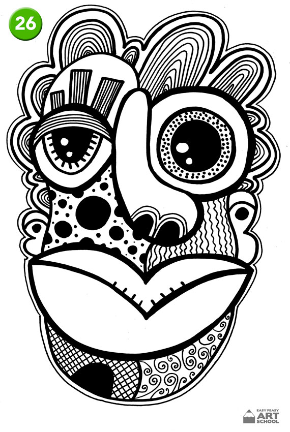
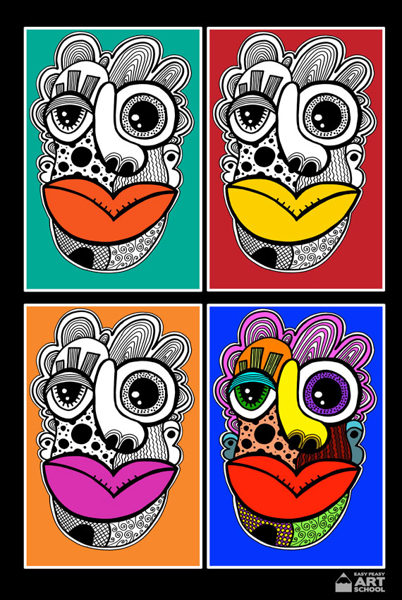
NEW: Big Mouth
Intermediate Level
This eye-catching abstract portrait lesson focuses on using the elements and principles or art to grab the viewer’s attention.
In each step, we’ll learn to think about how we can use the elements and principles to improve our design.
Abstract portraits are great to draw as there is no pressure to make them look realistic. As long as we include the basics like eyes nose, mouth etc, everyone will know it’s a face.
Materials
- White paper
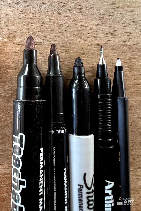
- Black felt tip pens in a variety of thicknesses
- Paint or coloured markers of your choosing to add colour
- Table cover or newspaper to protect your work area
- Paint shirt or apron
Easy Peasy Tips:
- You could also add your own creativity to this lesson. Why not think of a different hairstyle or shapes of your own to fill the spaces on the face?
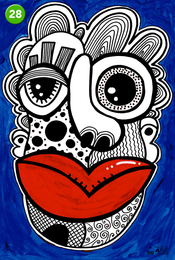
- In our version we have added colour with blue and red paint. You could also choose colours of your own or colour the whole face using felt tip markers or pencils.
- Have you heard of the elements of art? The elements of art are the basic ingredients of all artworks. They are: line, shape, colour, space, texture value and form.
- If the elements of art are the ingredients, the principles of art are the recipe. They are what we think about when deciding how to put the ingredients together.
- The principles of art are: balance, contrast, repetition, harmony/unity, emphasis and movement/rhythm.
For The Teacher:
- Whilst this is an eye-catching artwork for the classroom, it’s also a valuable chance to teach or revise the elements and principles of art.
- In this lesson the main elements covered are line, shape, space and colour.
- We also touch on some of the principles of art. These include balance, emphasis, contrast, pattern and harmony.
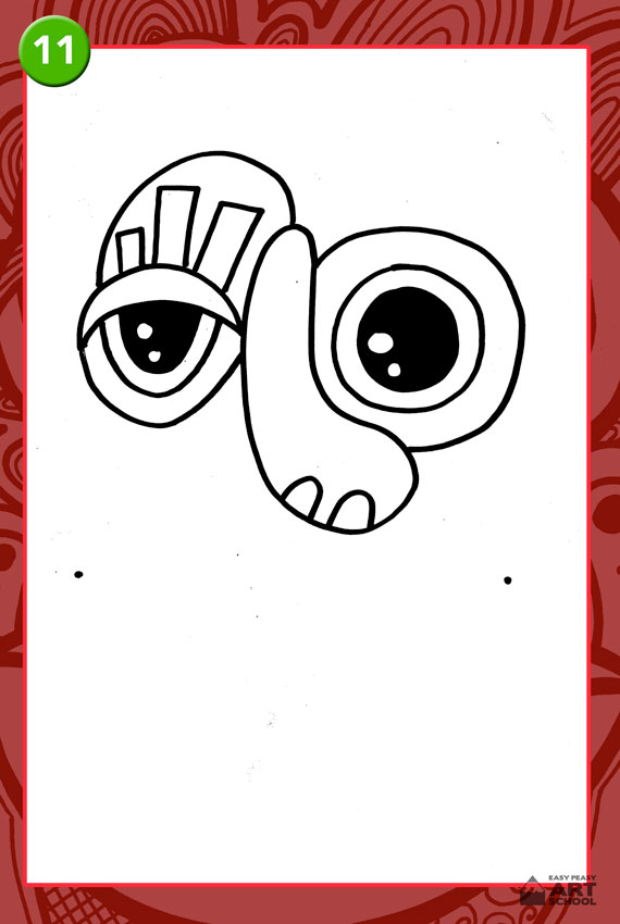
Steps
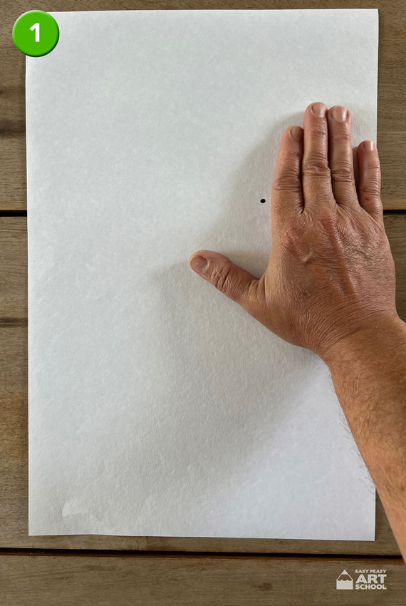
Place your paper portrait style
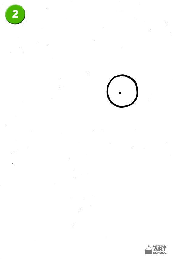
- Drawing: To begin our drawing, using your black marker, place a dot approximately 1/3 of the way down from the top of the page and about the width of your hand from the edge of the page.
- Using the dot as the centre, draw a neat circle around it about the size of a golf ball.
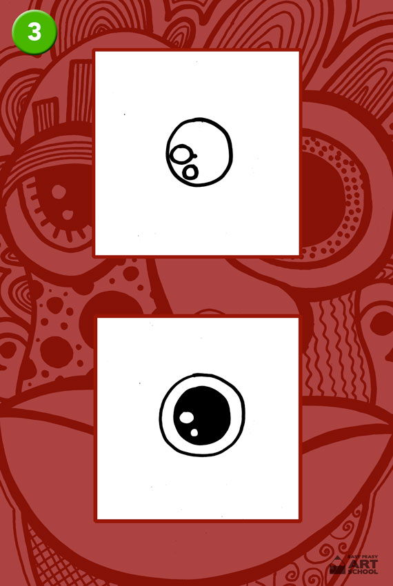
- Inside the circle, draw two smaller circles as shown. Then colour the pupil black leaving the smaller circles white. These are the reflection in the pupil. Once you have coloured the pupil, draw another circle around it leaving about 1cm gap.
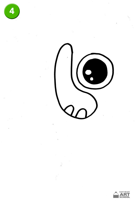
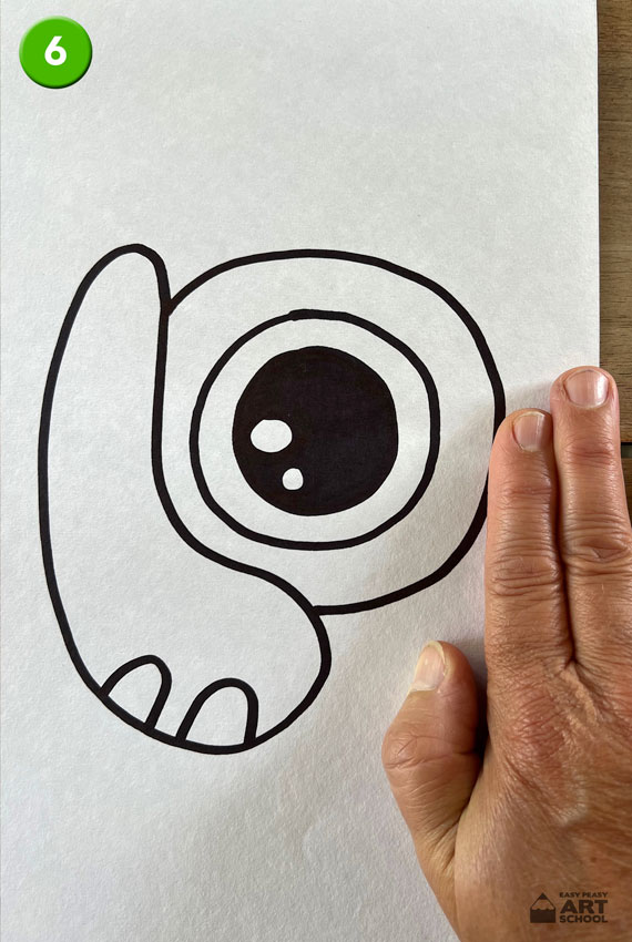
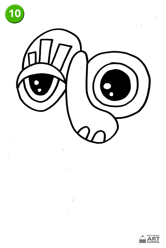
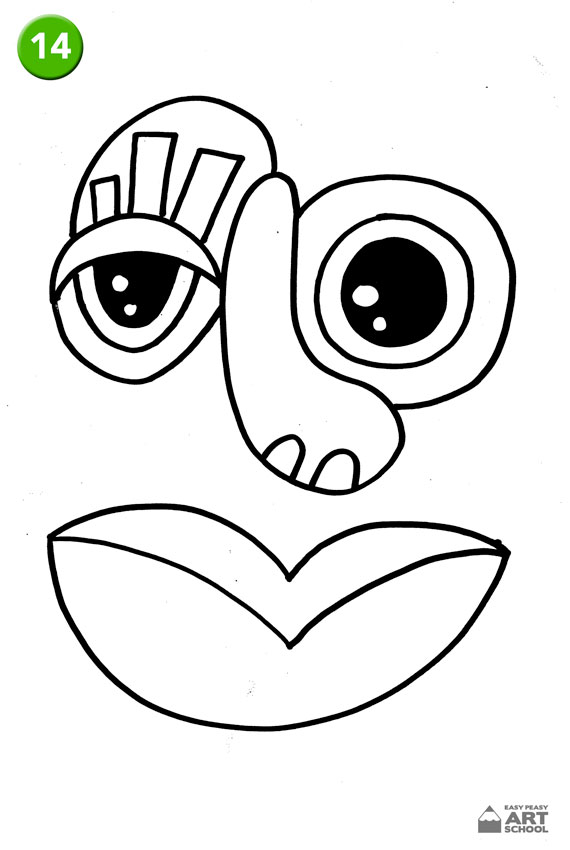
- Now draw a large curved blob shape for a nose followed by two arches for nostrils.
- Draw a large curve as shown to form part of the face. A big part of this artwork is thinking about how we use the space of the page. We want the face to take up most of the page without a large empty background. Try to leave enough space between the curve and the edge of the page for the hair but not too much so that it looks like there is something missing.
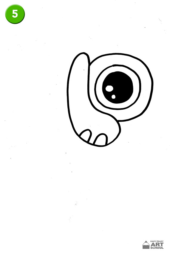
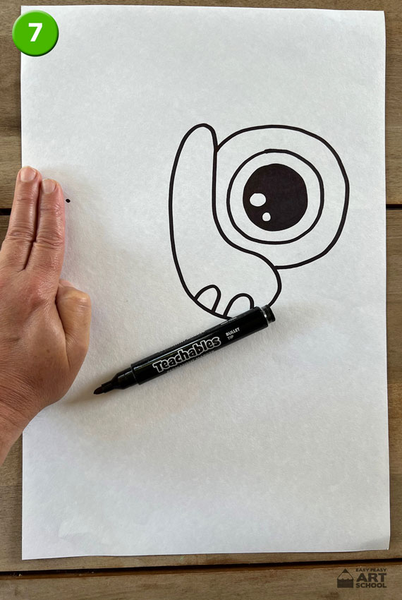
- In our drawing there is a gap of two finger widths. How many finger widths is the gap in your drawing?
- On the opposite side of the page, measure the same number of finger widths and place a dot as shown. This will help to place our portrait in the middle of the page and space.
- Draw an eyelid by drawing two curves from the dot to the nose as shown.
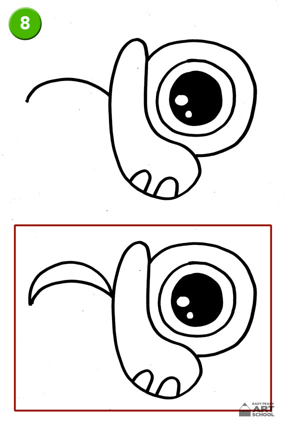
- Complete the second eye by drawing three letter U’s or curves as shown under the eyelid. Then complete the pupil the same way that we did on the first eye.
- Starting at the top of the nose, draw a large curve over and down to the eye. Remember to think about the space and leave enough room for hair. Inside this shape, draw three rectangular shapes for eyelashes. In most of this artwork, we use curved shapes and lines. This helps the whole design work together in what is called harmony or unity. Sometimes though we need to add a little bit of difference to create interest. This is called contrast. Our rectangular eyelashes are in contrast to the rest of the shapes in the drawing.
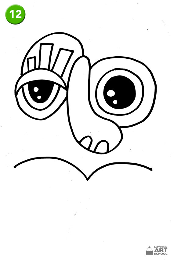
- Once again use two finger widths from the edge of the page to mark the start of the mouth.
- Join these dots by drawing the top of the lips.
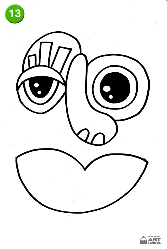
- Draw the bottom of the lips with a large, curved line. Remember to leave enough space for the chin.
- Now draw the centre lines of the lips. Our artwork is called Big Mouth because of these giant lips. They are the main feature of the artwork and really stand out. When one feature stands out more than others an artwork it is called emphasis.
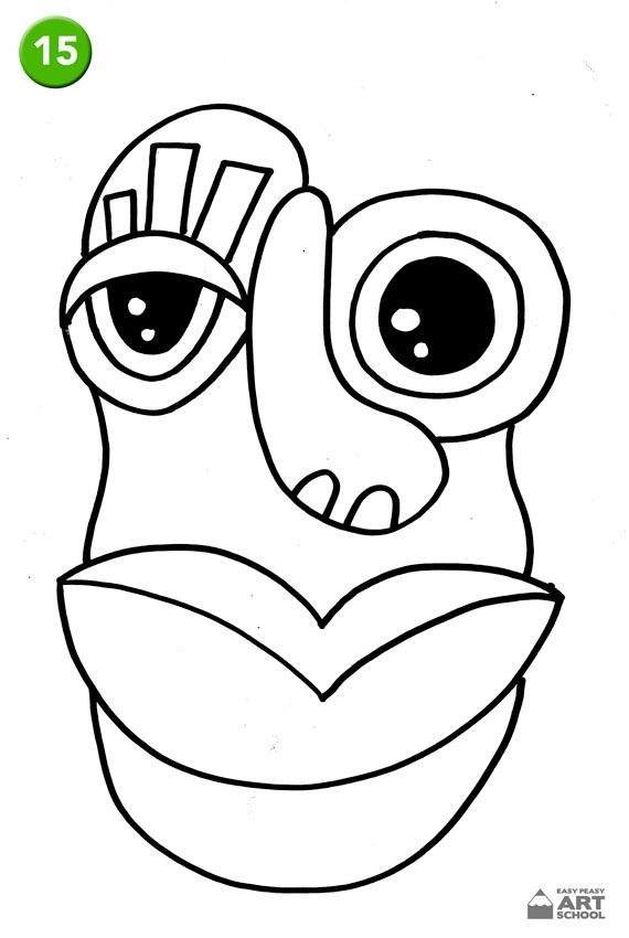
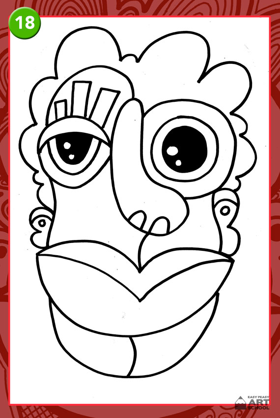
- Draw curved lines for the chin and sides of the face. Remember to think of your spacing and distance from the edge of the page.
- Divide your head in half by drawing curved lines from the nose to the lips and the lips to the chin.
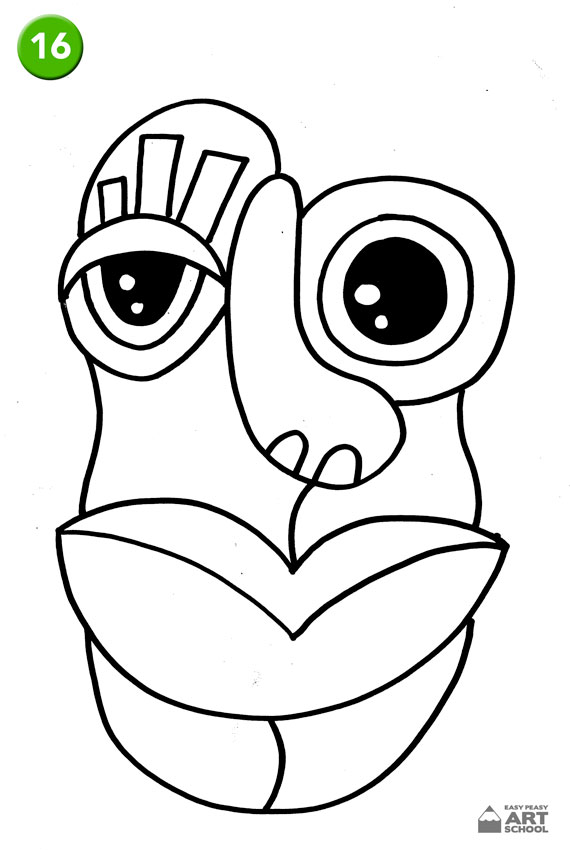
- Add some ears. You can make them the same or different sizes or even add earrings.
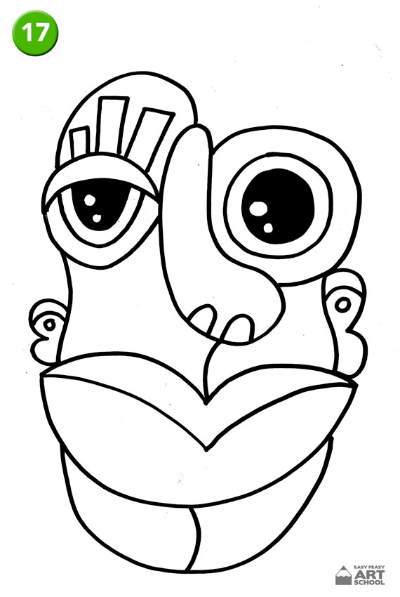
- To continue with our curved line design, add the hair to your portrait. Once again try to fill the space without touching the edge of the page.
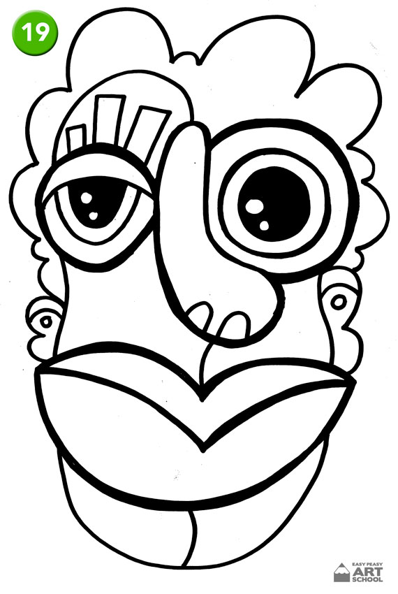
- Emphasis: In our portrait, the most important features are the eyes, nose and mouth. We want them to stand out more than the other parts of the artwork. Because we wont be using colour, this can be a little tricky. One way we can achieve this is by changing the thickness of our lines. Using your thickest marker, trace around the outside of the lines on the eyes, nose and mouth to make them thicker and emphasise them.
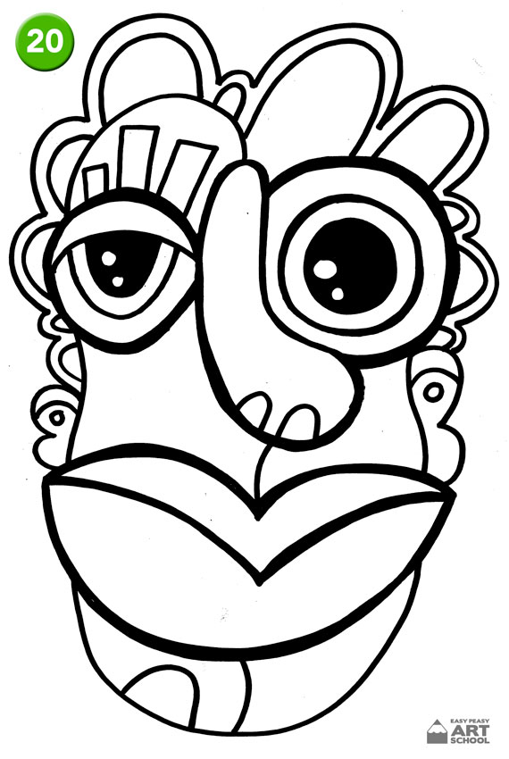
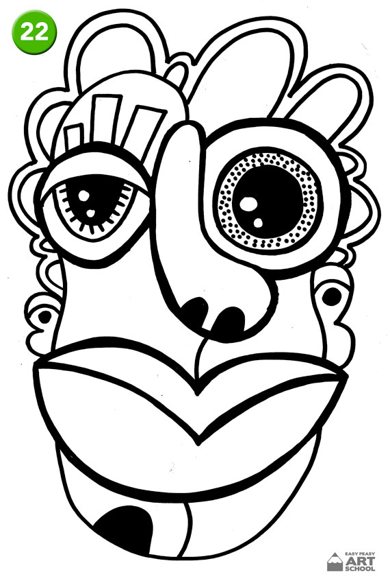
- Let’s start creating some smaller shapes in our portrait. Inside the hair, break up the space by drawing smaller curves as shown. Then draw an arch shaped line for a chin.
- To add contrast and to balance our artwork, we need to colour other areas of our portrait black. Here you can see how we balance the pupils at the top by colouring the chin. We also colour parts of the ear and nostrils to help add contrast to the rest of the design.
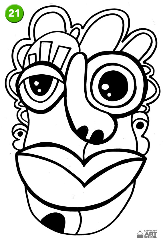
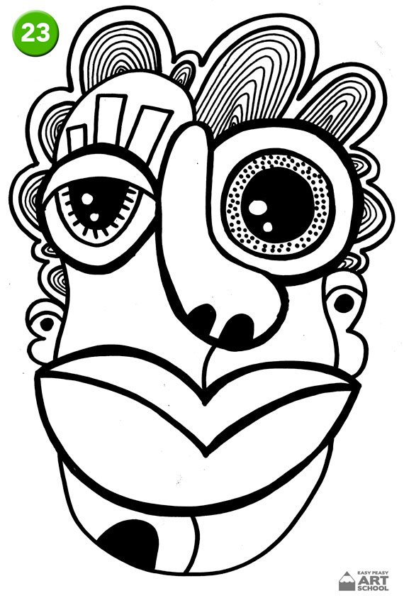
- Now let’s start adding patterns and texture to our portrait. This is where a good variety of black pens will help. Make sure you use a combination of thick and thin lines or details. Also remember that you can create your own decorations or you can use ours as a guide. Begin by adding dots and dashes to the eyes as shown.
- Using thinner lines, add a repeating design inside the hair to fill the shapes. Just remember that the thicker the line is, the more emphasised it will be. With less important lines you should make them thin.
- Add thin lines to the eyelid and eyelashes.
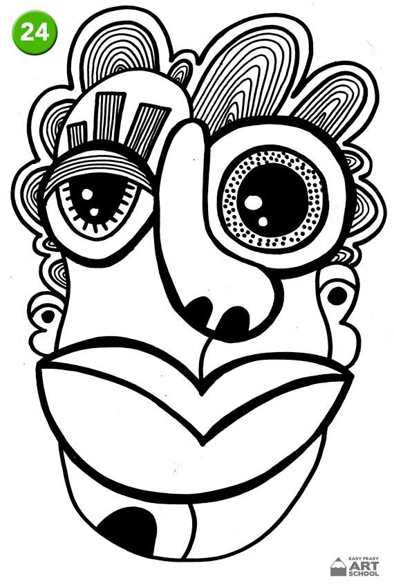
- Continue adding patterns and designs to your portrait. Notice how we deliberately left some areas of the portrait with no patterns or designs. This was done to contrast all the shapes that did have patterns.
- To complete your drawing, draw a thin border surrounding the portrait as shown.
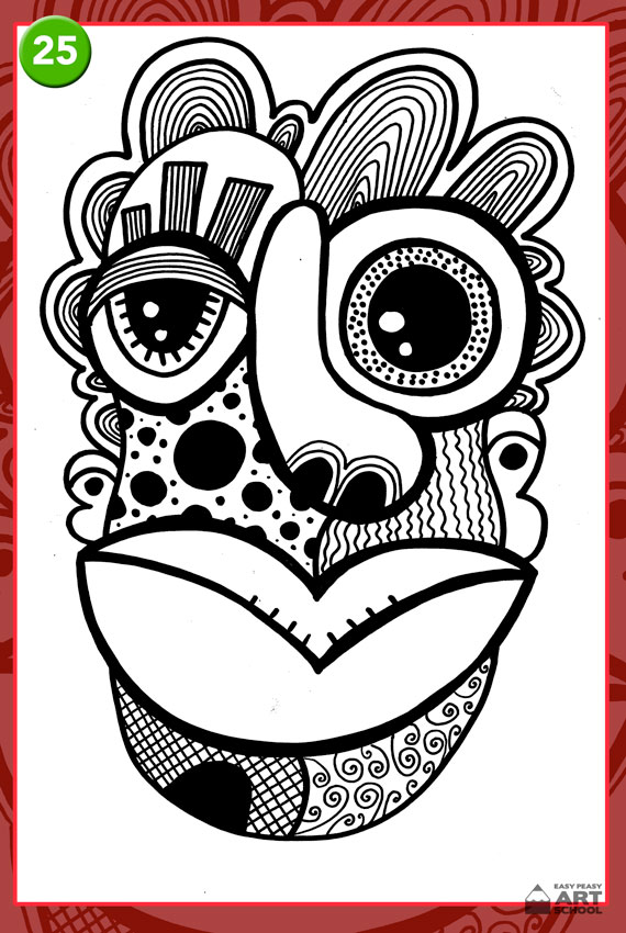
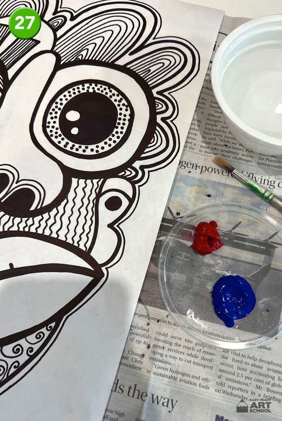
- Colour: Begin preparing the materials that will add colour to your artwork. We will be using poster paint but you could also use watercolours or coloured felt markers. You can also choose the colours that you would like to use. We will be using red and blue.
- Carefully paint or add colour to the lips and background. Be really careful to stay inside the lines. Why do you think we only added colour to the lips and background? We chose these limited colours as we wanted to emphasise the big mouth and the elements and principles of art we used in our design. Your artwork is now complete.
What do you like about your artwork? What would you do differently next time?
Other ideas:
- If you liked this lesson, why not try one of our other lessons that focus on abstract portraits or patterns?