Free Lesson – Picasso’s Pet Fish
Beginner Level
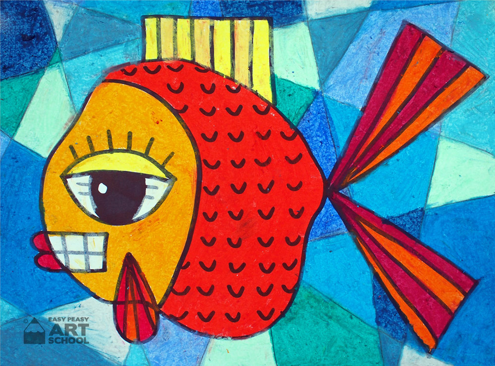
Imagine Picasso had a pet fish! How would he draw it? This fun activity lets you be creative and teaches you about complementary colours and shades of colours.
Materials
- Sheet of paper
- Black permanent marker
- Lead Pencil
- Oil pastels
- Optional: paper stumps/smudging sticks. These are available online, at art stores or even at some discount variety stores with art/craft sections.
Easy Peasy Tips:
- Make sure you hold your oil pastel using a key grip
- Make sure you press hard and use short strokes. Big strokes introduce white spaces in your work.
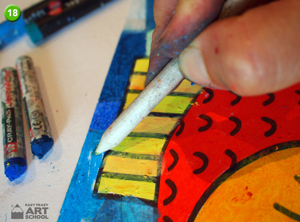
- Paper stumps are a cheap and fantastic tool to use with any medium that needs smudging, blending or tidying up. They are made from tightly rolled paper. They can’t be sharpened with a sharpener but can be tidied up with a piece of sandpaper.
For The Teacher:
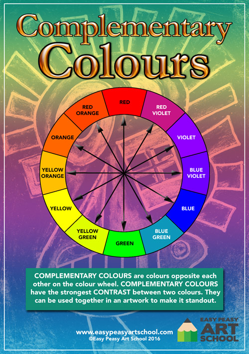
- Talk with your class about complementary colours and how they can grab a person’s attention in an artwork.
- Show the class a colour wheel and brainstorm a list of complementary colours. Remember that a complementary colour is any colour opposite another on a colour wheel.
Steps
Place your paper in landscape style
- For this artwork you will need to fold your paper from top to bottom approx. 1/3 of the way across the page. Ask your teacher or parent for help if you have trouble with this. An easy way to do it is to roll one side of the page over towards the other until you have two rectangles the same size, then crease your page.
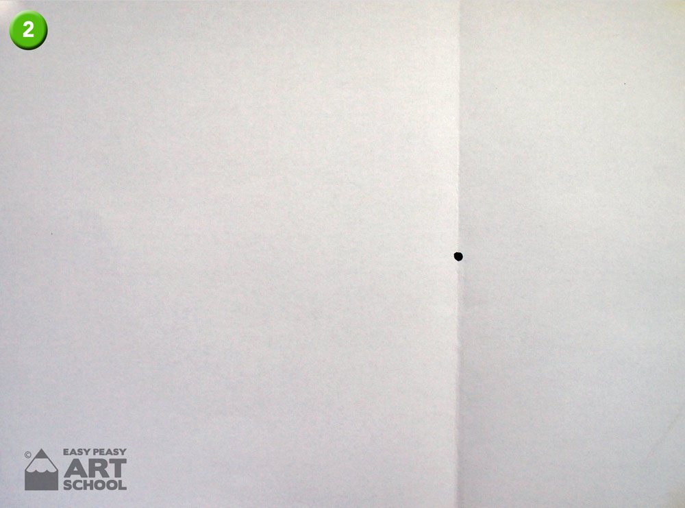
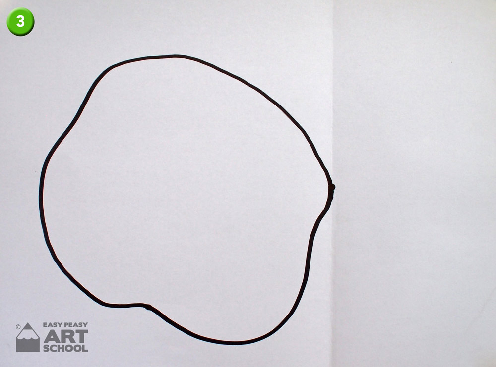
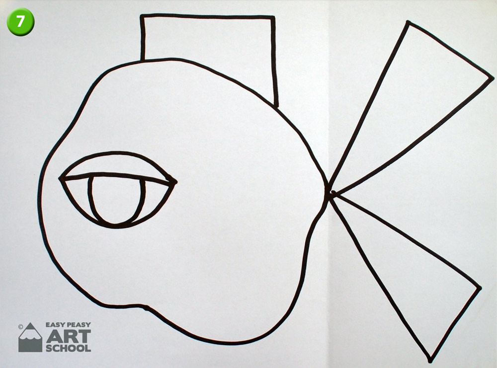
- Drawing: Place a dot in the middle of the folded line. This is the starting point.
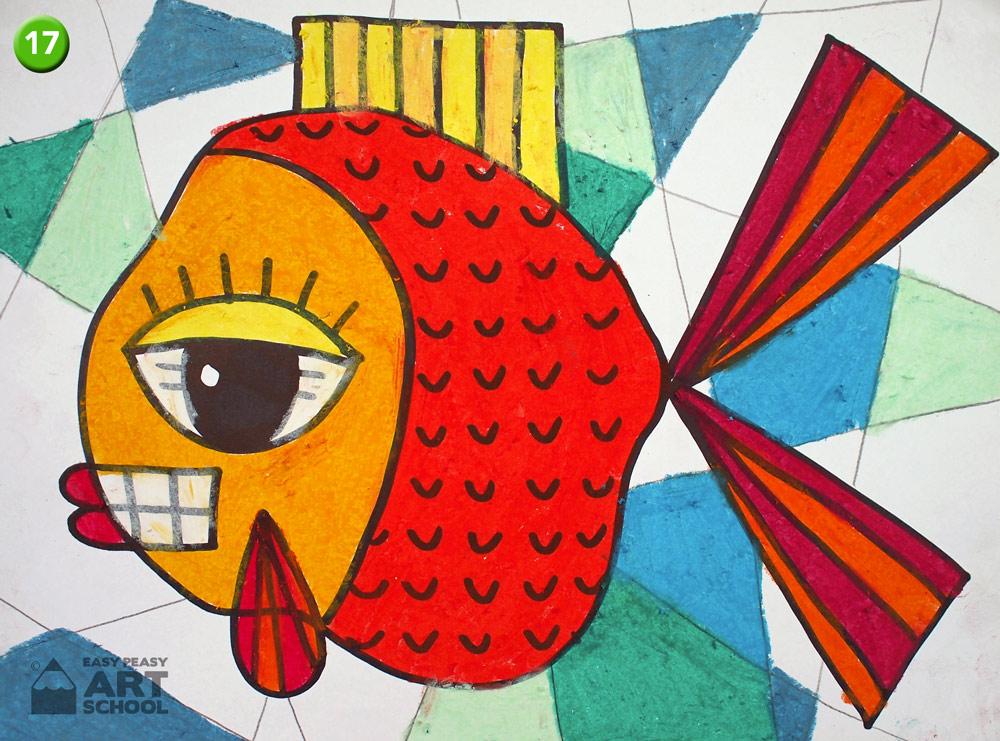
- Starting at the dot draw a large blob for the body. Think of an unusual shape, not your usual fish shape. Also, try and take up lots of space on this side of the paper.
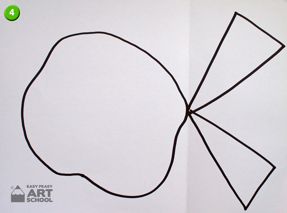
- Now on the other side of the line, start at the dot and draw two large triangles for the tail.
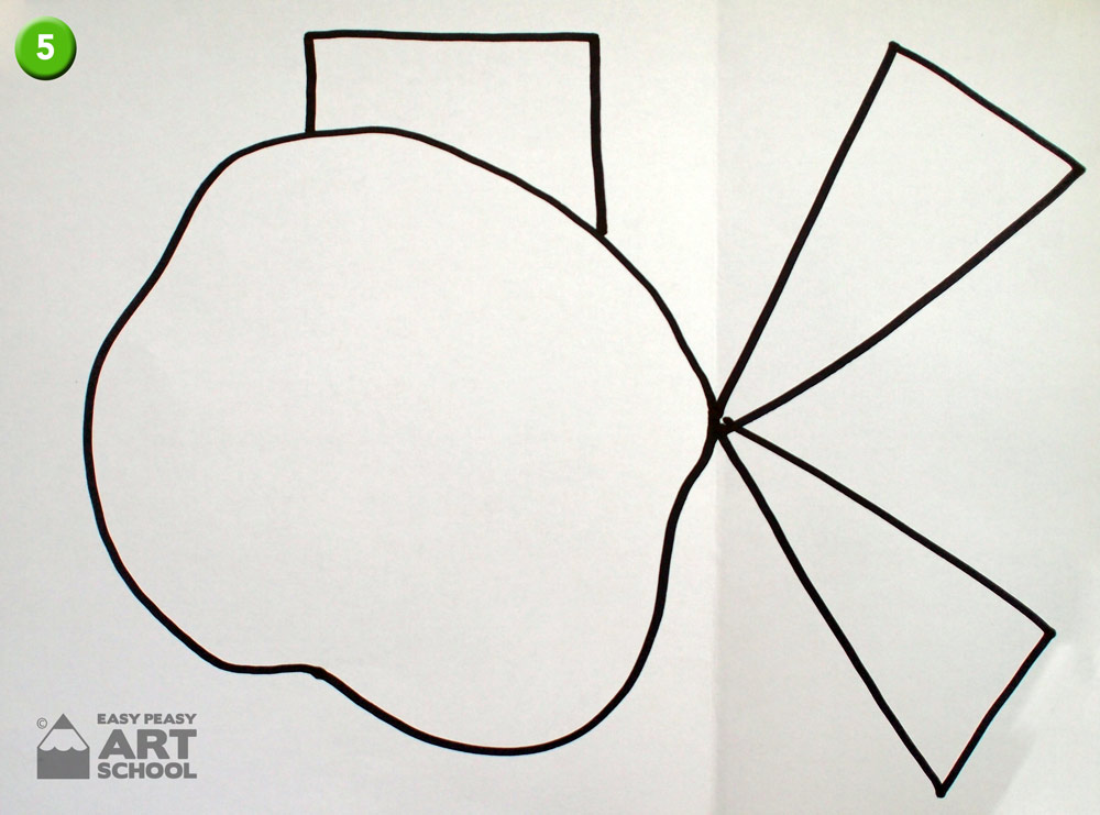
- On top of the body add an unusual shape for the fin. In this case we used a rectangle.
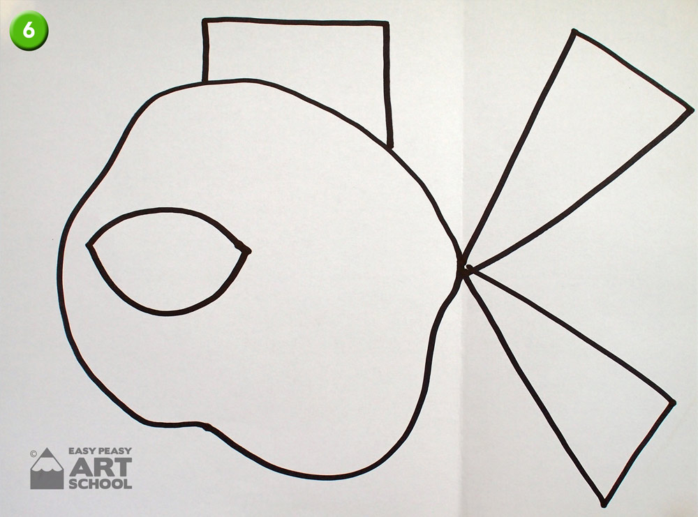
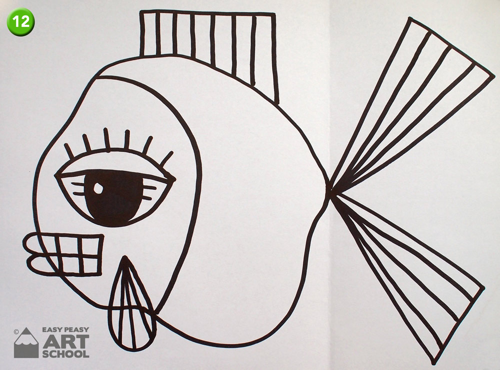
- Now for the eye. One of the things that stands out in this artwork is the large eye. So try and keep it BIG! Draw a large eye shape towards the front of the body by first drawing a frown shaped line then joining it with a smile.
- Add an eyelid and a set of brackets for the pupil.
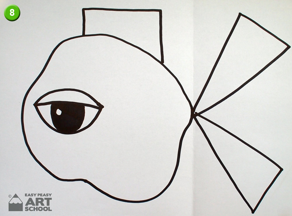
- Draw a small circle inside the eye then colour the rest of the pupil black with your marker. This small circle is light reflecting and adds interest to an eye.
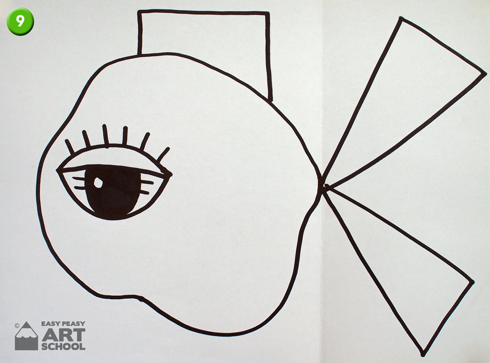
- Add eyelashes and detail to the eye.
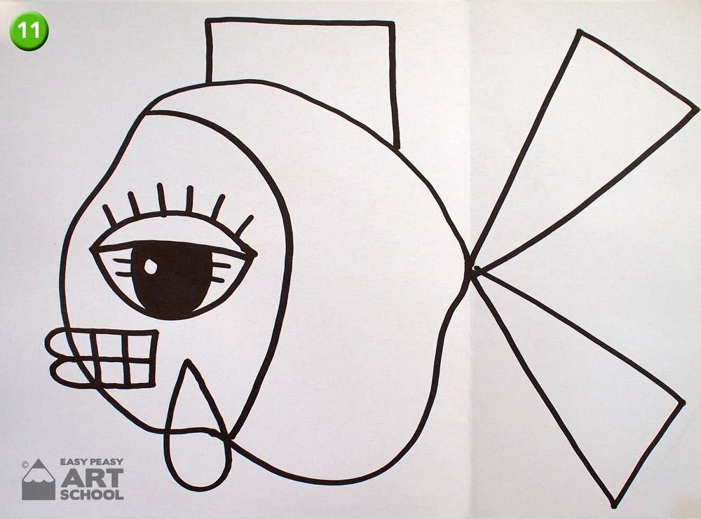
- Underneath the eye, draw a rectangular mouth with teeth and then add some lips on the front of the fish.
- Also underneath the eye, draw a large water drop shape that extends out past the body of the fish. Then add a large curved line from top to bottom for the gills.
- Draw evenly spaced lines on each of the fins and tailpieces. This adds detail to your picture.
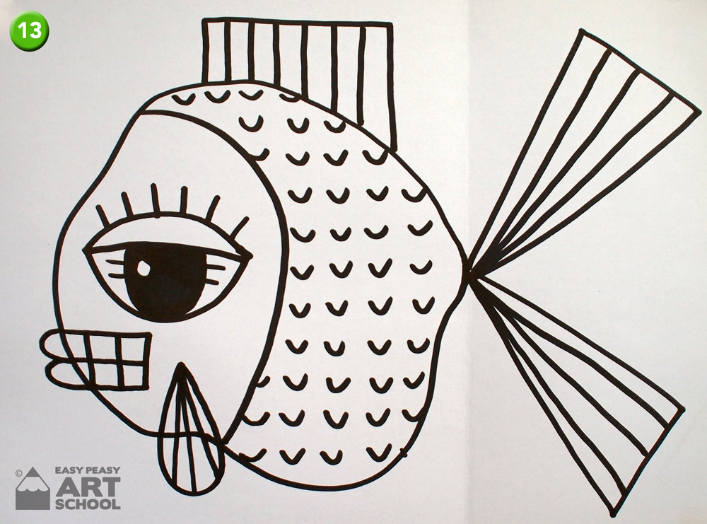
- Now think of a pattern for the scales. We’ve used evenly spaced small smiles to create a pattern. You could create your own. The scales add texture to your work.
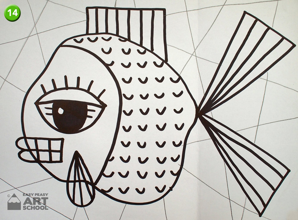
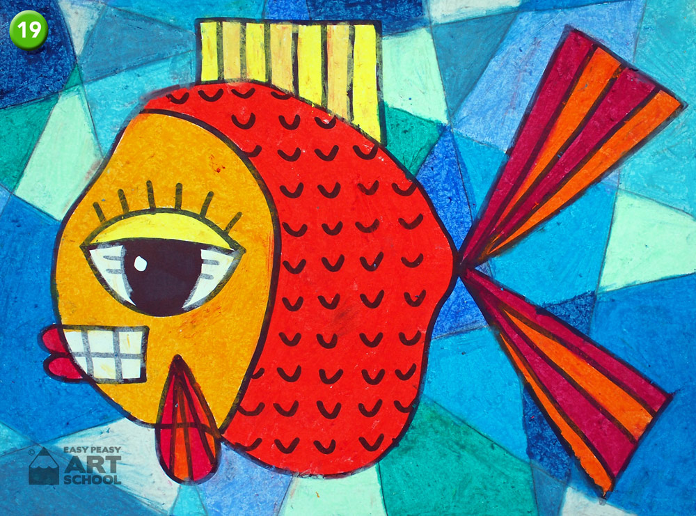
- To break up the background so we can use more colours, use a pencil and draw straight lines behind the fish from top to bottom. Draw them on different angles to try and break up the blank spaces into smaller ones. Now draw pencil lines from side to side behind the fish, once again breaking up the larger spaces into smaller ones.
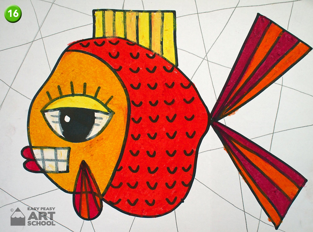
- Colouring: From your oil pastels, try and find as many different oranges, reds, yellows, flesh tones or even whites. Think Autumn colours.
- Use these colours to colour in the different sections of the fish. Try and use as many of these colours as possible. Don’t forget to colour parts of the eye and teeth white. A picture always needs white!
- Now find as many blues, greys and even turquoises or blue-greens. Use these colours to colour in each of the seperate sections of the background for the water. Make sure that you don’t use the same colour next to each other.
- Paper Stumps: The smaller sections of the background or the straight lines between colours can be a bit tricky. If you have the paper stumps these can be used to tidy up the lines and to smudge the colour into the smaller spaces. They can also be used to tidy up any little white spaces in your work.
- Now that it’s all tidied up, Your Picasso’s Pet Fish is complete!
What do you like about your artwork? What would you do differently next time?
Complementary colours.
You might notice how much this artwork stands out? That’s because it uses complementary colours. Complementary colours are colours opposite each other on the colour wheel and always look amazing when used together. One example of these colours are orange and blue. This artwork really stands out because of this combination. Read more about complementary colours in our Art Knowledge section of Easy Peasy Art School.
Other ideas:
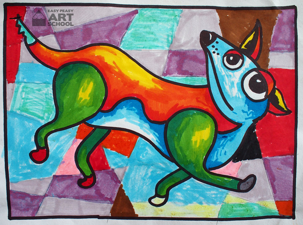
- Use felt tipped markers or other mediums to come up with a design for more of Picasso’s imaginary pets. How about a dog?
- Make it easier for younger or less confident students by painting the fish and background with tempera disc water paints instead of colouring with oil pastel.